IgnitED Labs
Website Redesign
2021
Prior to this project, IgnitED Labs had been utilizing a single-page website to house the entirety of its digital resources.
Pre-pandemic, the labs employed an in-person service model. Students, educators, and any member of the ASU community could visit any of our three physical tech lab locations for technology demonstrations, course support, or project fabrication.
In May 2020, IgnitED Labs decided to make a complete shift from in-person service to digital content creation full-time. Moving forward, this project came about when the growing catalog of in-house produced videos and guides outgrew the original design.
Our team's goal was to utilize the circumstances to develop an engaging experience akin to our in-person services with the added benefit of being accessible on demand.
Role
conceptualizing and creating the website content flow
designing and prototyping the user interface of the website
developing the collection of resources available on the site post redesign
Software & Tools
-

Adobe XD
-

Photoshop
-

Illustrator
Design Process
-
IgnitED Labs Online is a one-stop website for informational resources pertaining to new and emerging educational technology, providing an approachable and engaging site that is easy to use.
-
To begin planning, we utilized EDT180's coursework (provided by the instructors) as a baseline for our design.
In addition to the project itineraries, we evaluated data gathered through "tech visits," our remote video conferencing service where students can set up one-on-one sessions for course support. This information provided insight into student needs and helped accurately highlight the specific resources our user base was avidly seeking for each assignment.
-
In addition to our analysis, we conducted competitor audits to establish what is working and what is missing from the currently existing resources from other companies.
We looked at the National Geographic Kids website as an indirect competitor to understand what creates an approachable experience when introducing new and potentially robust information.
We also audited a direct competitor, PennStates's Experience catalog, to get an idea of how another university approached these resources and presented them to their college-aged demographic.
University Branding
ASU employs a brand standard that all university-affiliated content must strictly follow. The IgnitED Labs website is no exception. Every element has been curated, from color schemes to backgrounds to fonts and typography, in order to reflect ASU's strong brand identity.
IgnitED Branding
The IgnitED Labs color palette is derivative of the ASU official color palette. We are pulling the ASU green as the primary color and the ASU blue and gold as secondary colors. When designing with the brand standards in mind, we moved to utilize the more vibrant colors within the official color palette to evoke our own brand voice.
Stepping away from the darker ASU maroon and black, the IgnitED color scheme evokes a sense of playfulness and exploration. Facilitating an approachable environment is one of our main goals, and the standard ASU color scheme contextually projects a much more formal vibe. We wanted to ensure that although we exist under the university, we are actively developing and contributing to a space of our own.
Designing for the Long Haul
Our Tech Experiences section had an unexpected alteration during the design process. Tech Experiences are a curated selection of interactive activities, accessible without needing VR headsets, 3D printers, or other pricey technology.
In the early stages, the Tech Experiences section planned to have a landing page that branched off to separate pages for listings by platform type (i.e., websites, apps, and videos). This division felt logical because this was how we internally organized the content when writing entries for this section. But as we evaluated the website flow, it became evident that this created an undesirable step, an unnecessary extra click.
Understanding the Neccesities
During the design process, there was careful consideration for the website's longevity as new student workers cycled in semester by semester. Not only because the staff would be consistently evolving but because the website content is produced and published by student workers with limited weekly hours, employee training, and website maintenance needed to be streamlined.
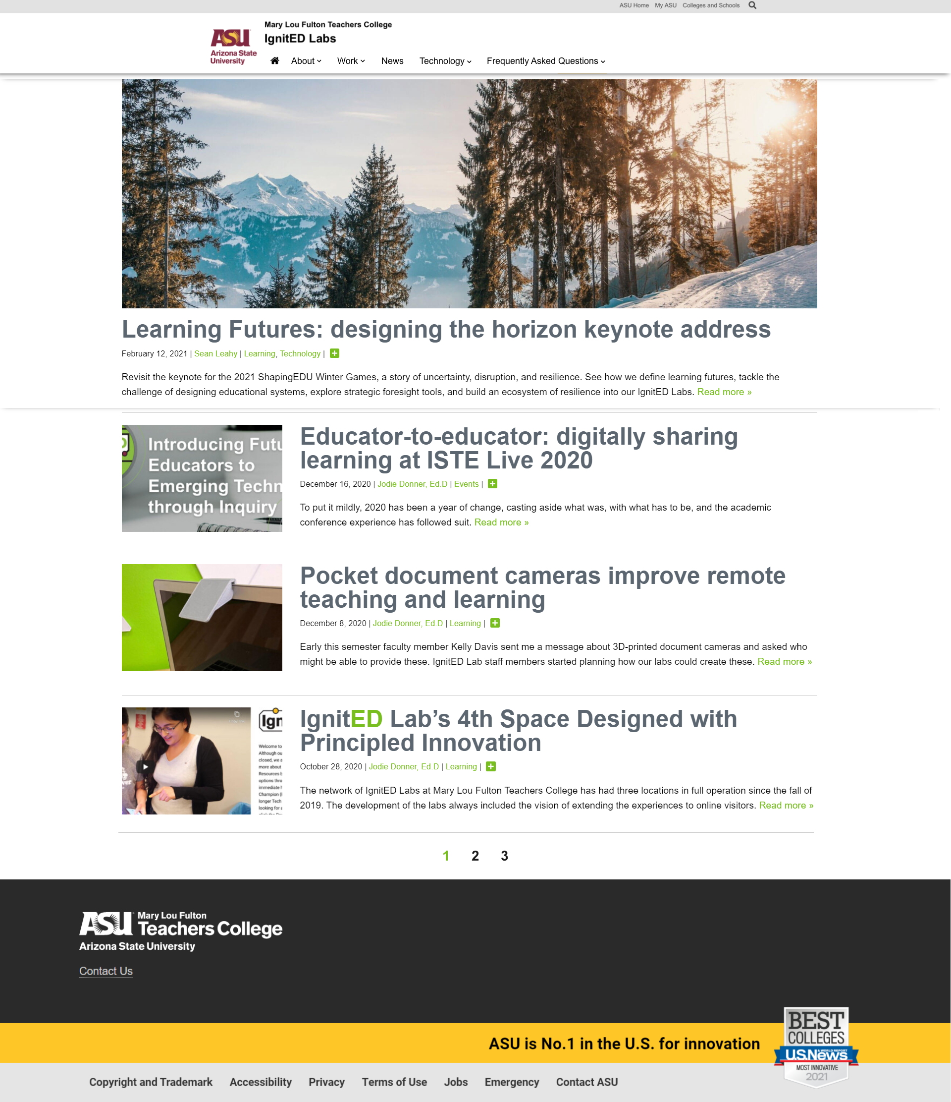
On the original sire, pre-redesign, the video resources were contained in a carousel at the bottom of the single-page layout.
More demanding in terms of skill and time, the in-house produced video content needed to be highlighted appropriately. When speaking with students about their experience with the single-page design, many didn't realize the videos were located at the bottom. Additionally, many expressed they were unaware that the videos were a primary resource the labs offer.
Valuing Our Resources
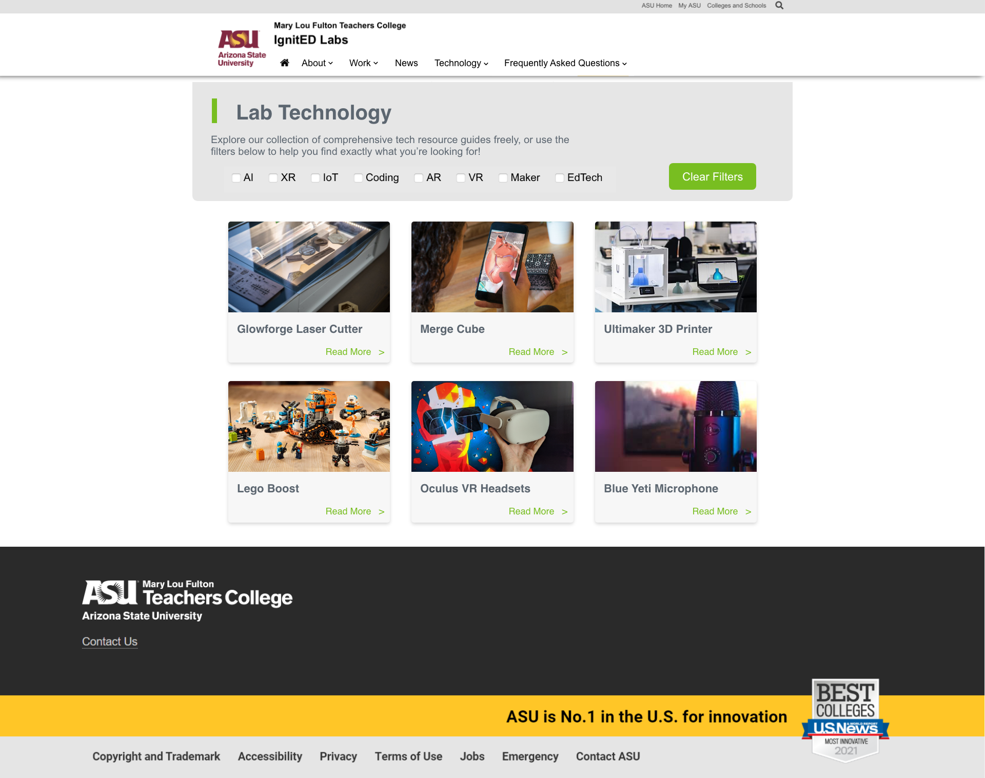
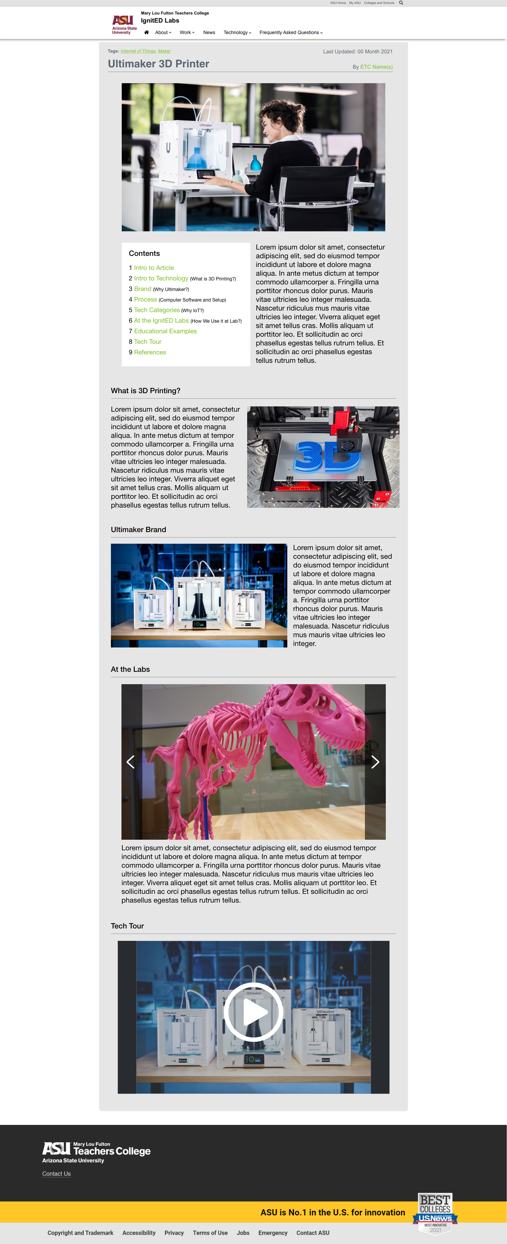
We implemented a similar card structure across our various article-based resource pages to simplify the publishing process and the training process. An easier workflow is more manageable for new student employees to adapt.
We discovered that users didn't necessarily care to view the listings by platform type and preferred the grid view containing all content. Although initially hypothesized to be overwhelming, allowing users to view all content and then opt for filters on their terms significantly elevated the user experience.
Additionally, even though division by platform wasn't a feature highly prioritized by users, another type of filtering was. When researching for specific class assignments, students often need to find experiences based on genre or related technology (e.g., experiences related to art history or experiences utilizing virtual reality).
With the grid, optional filters, and the simplified card design, users could quickly scan, compare, and open the relevant listings with relative ease. Although it is nice to have great aesthetics, functionality is key, and ultimately, we are designing a user experience that prioritizes the page's content.
Beyond just shifting a few elements around, the user flow of the entire site needed to be adjusted. A vital task of redesigning the site was to ensure visitors knew that the resources were the focal point.
By creating a home page with straightforward CTAs, pulling users to pursue the resources, we could push traffic to the video resources library directly.


